ECatalog Manager/.../Business profile/Look and feel
< ECatalog Manager | Configuration | Business profile(Redirected from Look and feel)
Jump to navigation
Jump to search
This section of the configuration can be accessed from Configuration >> Business profile >> Look and feel when the app is configured with Superuser role.
| The current user role can be changed by using the shortcut User role located in the slider menu in the Home screen or going to Preferences >> General settings >> User role. |
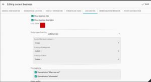
This section allows to configure the following parameters:
- Show business icon: defines if the business icon is shown in the Home screen.
- Show business description: defines if the business description is shown in the Home screen.
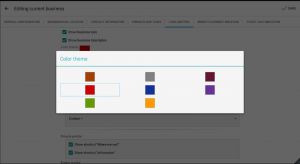
- Color theme: sets the color theme used for the different screens and sections of the app.
- Design type of catalog: sets the layout used to display the items and categories of the catalog. See below the different options and its parameters:
- Show shortcut "Where are we?": defines if the shortcut is shown in the home screen of eCatalog Manager (Private profile) and/or in the home screen of the published catalog that you have hired (Public profile).
| If you don't have yet your own application like eCatalog DEMO, take a look at Publish Catalog for more information. |
- Show shortcut "Information": defines if the shortcut is shown in the home screen of eCatalog Manager (Private profile) and/or in the home screen of the published catalog that you have hired (Public profile).
| If you don't have yet your own application like eCatalog DEMO, take a look at Publish Catalog for more information. |
Design type of catalog
There are three types of layouts for the catalog where each of them has specific configuration parameters.
Standard view
The sections of this view are explained at Standard view.
The following parameters can be set for this view:
- Type view of items by default: allows to select the view of items used by default, the user will have the chance to select a different type view later from a command that is located in the toolbar. Following are the different options available:
- List.
- Small icons.
- Medium icons.
- Big icons.
- Bigger icons.
- Ordering of categories (default value): sets how the categories are sorted by default.
- Custom (default value): this type uses a custom sorting defined by the user.
- Name (default value): sorts alphabetically by the Name attribute of each category.
- Ordering of items (default value): sets how the items are sorted by default.
- Custom (default value): this type uses a custom sorting defined by the user.
- Name (default value): sorts alphabetically by the Name attribute of each item.
- Type view of items by default: allows to select the view of items used by default, the user will have the chance to select a different type view later from a command that is located in the toolbar. Following are the different options available:
| Sorting options are now available for each category, take a look at Sorting for more information. |
View at 2 levels
The sections of this view are explained at View at 2 levels.
The following parameters can be set for this view:
- Show icons in list of categories.
- Show description in list of categories.
- Show icons in list of subcategories.
- Show description in list of subcategories.
- Ordering of categories (default value): sets how the categories in the left pane are sorted by default.
- Custom (default value): this type uses a custom sorting defined by the user.
- Name (default value): sorts alphabetically by the Name attribute of each category.
- Ordering of subcategories (default value): sets how the categories displayed in the panel of subcategories are sorted.
- Custom (default value): this type uses a custom sorting defined by the user.
- Name (default value): sorts alphabetically by the Name attribute of each subcategory.
- Ordering of items (default value): sets how the items are sorted by default in the panel of items.
- Custom (default value): this type uses a custom sorting defined by the user.
- Name (default value): sorts alphabetically by the Name attribute of each item.
| Sorting options are now available for each category, take a look at Sorting for more information.. |
Multilevel view
The sections of this view are explained at Multilevel view.
The following parameters can be set for this view:
- Rows of items per category: the number of rows of items that are shown in summary form in each screen.
- Ordering of categories (default value): sets how the categories in the left pane are sorted by default.
- Custom (default value): this type uses a custom sorting defined by the user.
- Name (default value): sorts alphabetically by the Name attribute of each category.
- Ordering of items (default value): sets how the items are sorted by default in the panel of items.
- Custom (default value): this type uses a custom sorting defined by the user.
- Name (default value): sorts alphabetically by the Name attribute of each item.
| Sorting options are now available for each category, take a look at Sorting for more information.. |


